👋 We're Knock. We provide a set of simple APIs and a dashboard that developers use to introduce transactional notifications into their products, without having to build and maintain a notification system in-house.
—
You always want to meet users where they are. If you’re a B2B product, that place is Slack. 750,000 companies use Slack and millions of people work in the platform each day.
If you’re a product manager looking to increase DAU/MAU, shipping a Slack app is one of the highest leverage things you can do. It means your customers will be able to interact with your product from the place where they spend most of their work day: Slack.
But a great Slack app experience requires nuance. Nonstop Slack notifications lead to notification fatigue, and your notifications have to compete in the same space as all the other Slack apps your customers use (plus messages from their coworkers).
The best Slack apps think of notifications as an opportunity to drive action and value for users.
The benefit of Slack: real-time, interactive collaboration
Slack is ubiquitous in the professional world. With the platform’s widespread adoption, your users already know how it works and expect notifications in Slack. And as you build out more sophisticated notifications, they’re already familiar with this extended functionality in the platform.
The power of Slack notifications comes from three core features:
- It’s real-time. Users receive instant alerts and updates, allowing for immediate response and action
- It’s collaborative. Users can work together, share information, and communicate within a team or between multiple teams.
- It’s interactive. Users can respond, make choices, and execute commands, facilitating a more dynamic and engaging user experience.
1. Real-time notifications
With email, notifications often go unnoticed. Email lacks the immediacy of Slack notifications, causing crucial information to be overlooked. Slack offers immediate, real-time notifications that enable users to quickly respond to critical updates or tasks, enhancing efficiency and allowing teams to promptly address issues or seize opportunities.
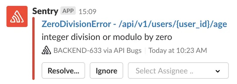
Say you were building an application performance monitoring platform and needed to add alerts. Notifying your SREs of an issue directly in Slack can be the difference between a service being down for minutes or hours.
Here is an example from Sentry:

2. Collaborative notifications
Collaboration isn’t built into email. You get cumbersome and fragmented conversations to keep track of. This makes collaborative discussions challenging to follow and manage, especially in real-time.
In Slack, users can discuss and make decisions together in threads underneath notifications and in specific channels where the entire team is present, without leaving the platform.
Again, using the example of APM alerts, the responding team can discuss the issue directly in Slack for every alert.
3. Interactive notifications
Email is a channel with limited interactivity. Users have to go to your app to perform most actions related to the notification, leading to disruptions in workflow and decreased efficiency.
The interactive nature of Slack allows users to perform actions directly from a notification, such as replying to messages, completing tasks, or approving requests. This interactivity reduces friction and enables users to get more done.
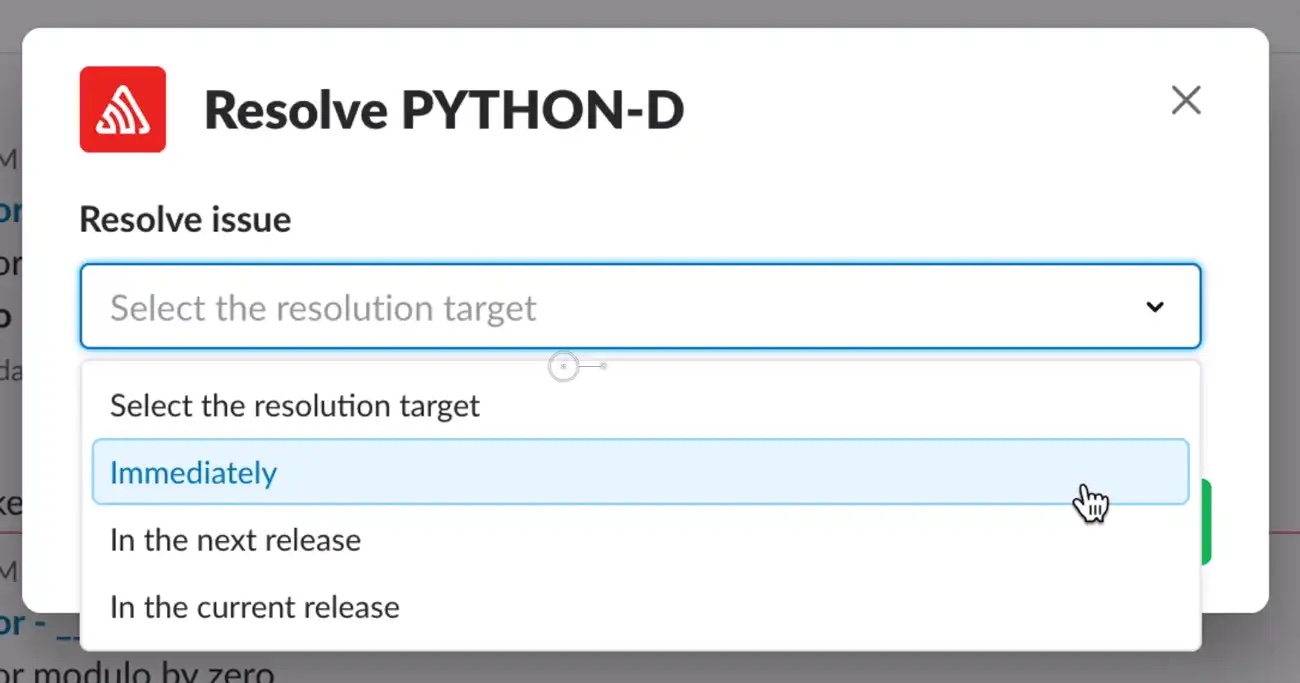
With our APM alert example, this might be setting the status of an issue or assigning the issue to a specific team member. In the example below from Sentry, you can see how the notification allows users to mark when an issue will be resolved, directly from within Slack.

Building the world’s worst Slack notifications
How do you use each of those features to your advantage?
If you want to build something good, sometimes it makes sense to think about how to build something bad. You invert the problem. If you were building a notification system to annoy users and decrease engagement, what would that look like?
- It would be overused. If Slack notifications are overused, they move from being helpful to being a continuous source of interruption. Sending out notifications for every minor update or task overwhelms users, leading to notification fatigue. Then users ignore the notifications altogether.
- It would miss the context for collaboration. A poor Slack notification would not provide adequate information or context, hindering collaboration and communication among the team.
- It would overdo interactivity. Trying to make every notification interactive or incorporating too many action items leads to a cluttered and confusing user experience.
With Slack, you are going into the heart of where a user works and manipulating what they are doing. There is a “do now” focus with Slack that you don’t have with email. This is good when the notifications are time-critical. But if you push everything to Slack, users can become overwhelmed, and feel that everything has to happen immediately.
Slack notifications have to be high-value to be seen by the user. If you get that wrong–send too many notifications, don’t give enough information, try to get them to do too much–your app is going to become another unread channel that no one ever reads.
Good Slack notifications find the right balance in each of these parameters.
Notifications need to be timely and essential
The system needs to alert users to pertinent information or tasks without inundating them with trivial updates. You shouldn’t set a notification for every change in your app. But, more importantly, you should allow your users to change their notification preferences and let them choose the types and frequency of alerts they receive.
By providing control over notification settings, you cater to individual working styles and preferences, ensuring that users receive the most relevant and desired information.
With our APM application example, we might want to see alerts when a service hits a specific failure rate.
Notifications should be context-rich to help collaboration
Every notification should be clear, concise, and, most importantly, actionable. Offer explicit instructions or options within the notification, allowing users to understand what steps are needed so they can act.
Concise but informative alerts allow users to quickly grasp the alert's essence and foster discussions within the team. Comprehensive, context-rich notifications need to provide sufficient information to the team, enabling them to discuss any problem in a thread for the notification.
With our alerts, we might want details on service, service contact, failure rate, and most recent PR.
Notifications need to balance interactivity with direction
Design notifications to allow users to perform minor, frequent tasks directly within Slack, while directing them to the main app for more extensive tasks. By distinguishing between tasks that can be resolved within Slack and those requiring the main app’s functionalities, you can protect a user’s Slack workflow and only pull them out of it for important tasks.
You can embed deep links within notifications, guiding users straight to the corresponding section in the app, thus saving time and mitigating confusion.
An alerting app might have simple tasks for assigning an SRE or changing status, but could push you into the main APM application to get further details and do more analysis.
Depending on your product, a Slack integration can be a valuable addition to your feature set. At Knock, we're focused on helping developers leverage Slack as a notification channel, so here are a few additional posts we've written on using Slack:
- How to autheticate users in Slack using OAuth
- The developer's guide to Slack's Markdown formatting
- Taking a deep dive into Slack's Block Kit
- The product manager's guide to designing Slack notifications
Building valuable notifications in Slack
To be incorporated into the user's Slack workflow, you want to push information into Slack for them, have them take action immediately, and then move on. Allow them to maintain a workflow and not see your notifications as an added distraction.
This is easier said than done. You have to find the right balance where you are giving them the context they need, without overburdening them and leading them toward notification fatigue.
We built Knock to help teams build Slack apps that do this. You can design your Slack notifications, batch notifications to avoid spamming users, add interactivity, and let your users take control of their notifications with Knock’s powerful preference model.
Check out some Slack notification examples for inspiration and signup here to get started for free.